A ground-up rebuild of MyRegistry's iOS and Android apps
Two Apps. One Broken Experience. One Chance to Fix It. New design system, new tech stack, and a unified experience across four registry types for the first time.
Executive Snapshot
Company: MyRegistry.com
Product Type: B2C Consumer Platform, Native Mobile App (iOS & Android)
Role: Design Co-Lead, end-to-end ownership from system architecture through production QA
Team: 2 Designers, 6 Frontend Developers, 2 Backend Developers, 4 QA Engineers, Creative Director
Scope: Design system, full app UX, 4 registry types, handoff process definition, QA review pipeline
Timeline: Design: Design: 4 months | Dev, Review & QA: 8 months
Impact
Co-led a full mobile redesign for MyRegistry: design system, core flows, and a team of 14. My gift detail screen, one of the most used in the app, introduced a tile-to-bottom-sheet transition and an inline edit state that made the experience feel native for the first time.
The Story
THE CORE CHALLENGE
How do you close a years-long gap between web and mobile without stopping the business?
MyRegistry had a strong web product and two separate native apps for iOS and Android. But both apps had fallen years behind. Features shipped on web never made it to mobile. In many cases, the experience users got on their phones was fundamentally different from what they saw in a browser.
The result was fragmented UI patterns, unpredictable interactions, and friction in the core flows users depended on most: adding gifts, managing registries, and sharing with guests. The gap had grown too wide to patch. Both apps needed to be rebuilt from the ground up.
User Risk
Users switching between web and mobile encountered a completely different product. Key features were missing, flows worked differently, and the visual experience had no consistency. The app felt like a lesser, outdated version of the platform.
Business Risk
The dev team was split, half on iOS and half on Android. Features took twice as long to ship and neither platform could ever fully catch up with the web. The structure itself was the problem.
THE STRATEGIC APPROACH
System-first. One codebase. Design direction set before a single screen.
I co-led design end-to-end alongside the Creative Director, owning the design system, component architecture, the complex user flows, the handoff process, and QA review. The scope covered four distinct registry types: baby, wedding, gift list, and nonprofit, each with its own logic, user expectations, and edge cases.
Rather than jumping into screens, the first decisions were structural. Get the platform right. Get the system right. Build everything else on a foundation that could hold the weight of the whole product.
- Built the design system from the ground up, starting with a MUI base and rebuilding the majority of components to fit brand guidelines, an 8px spacing system, and full light and dark mode.
- Architected the Figma library around instance swap, so every component update propagated automatically across hundreds of screens, keeping prototypes and specs accurate without manual rework.
- Designed every gift type end to end, mapping the full lifecycle of standard, cash fund, group, purchased, synced, and unavailable gifts across both list and grid view.
- Redesigned the notification system with date-based grouping, actionable notifications, and a clear read/unread model to replace a system that left users unable to distinguish new from old.
- Solved the cover image problem with a scroll-triggered behavior that lets personalization and usability coexist, and introduced separate crop controls for mobile and desktop.
- Defined a two-format handoff process that gave developers annotated specs and interactive prototypes for every flow, removing ambiguity before development started.
THE SOLUTION
A unified, native app experience
The rebuilt app spans the full user journey across four registry types: account creation, registry setup, gift list management, sharing, and the visitor experience. Every screen is built on the same design system, with consistent patterns, predictable interactions, and a visual language that feels intentional throughout.
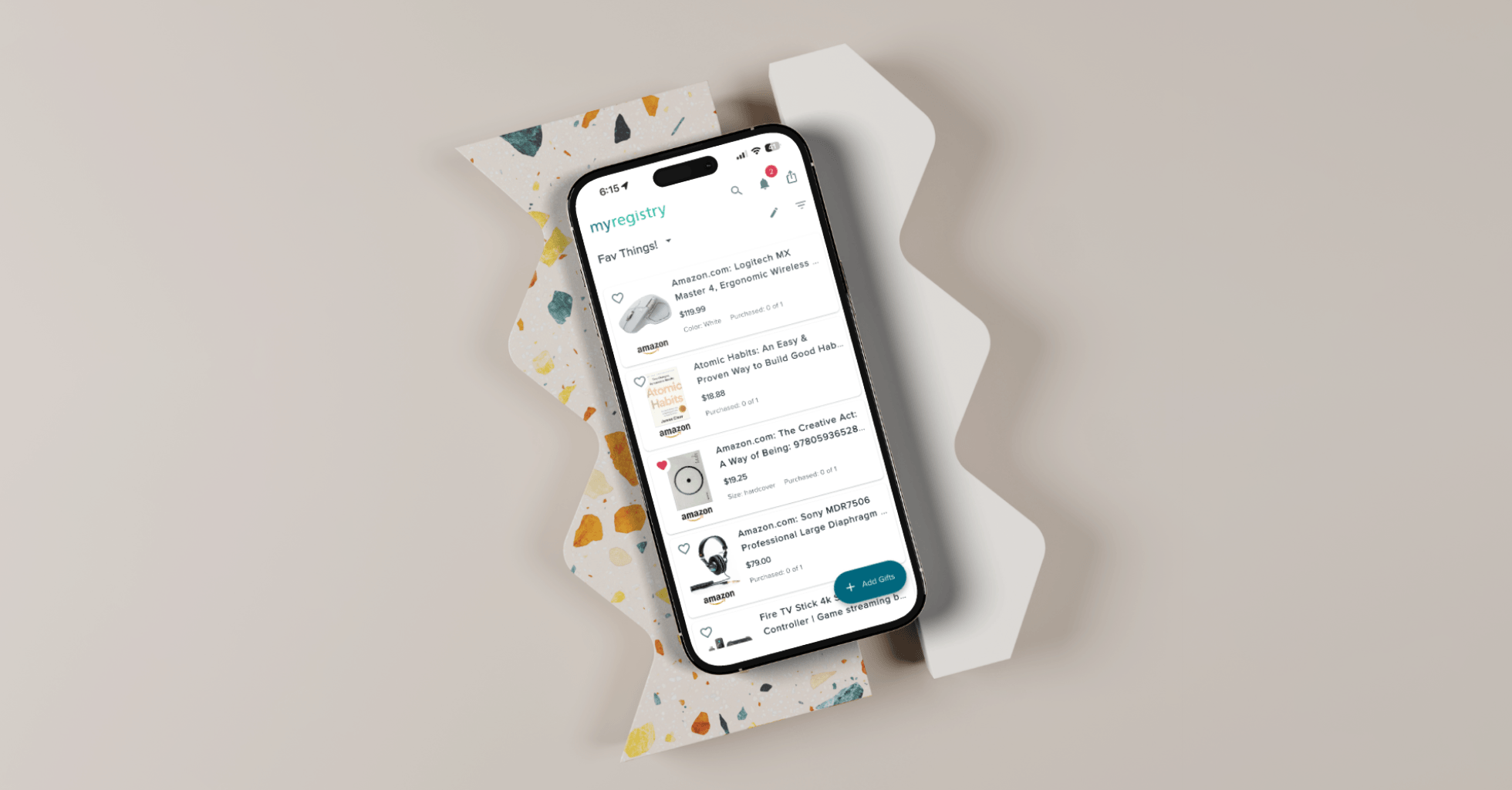
The gift list is the heart of the product and the most technically complex part of the redesign. Users can view their list in grid or list format, with every gift type handled correctly across both views. Cash funds, group gifts, synced items, and unavailable products all behave correctly and look deliberate.
The gift detail screen, one of the most used screens in the app, received a complete redesign. Tapping a gift tile triggers a subtle animated transition into a bottom sheet where the user can review full gift details. A third state reveals all editable fields inline, letting users update any detail without navigating away. The interaction is fast, fluid, and a significant step up from what the old app offered.
The notification system surfaces what matters. Today’s notifications are distinct from older ones. Read items look different from unread ones. Users can act directly from the feed without navigating away. A small change with a disproportionate impact on how useful the app feels day to day.
Registry personalization includes a cover image with separate crop controls for mobile and desktop, a scroll-aware header that compresses as users browse, and a profile system that keeps the user’s identity present without sacrificing screen space.
THE OUTCOME
More engagement, one product instead of two
- 19.9% increase in average engagement time per active user, rising to 21 minutes 45 seconds
- 20.2% increase in engaged sessions per user, reaching 6.3 sessions
- 11.2% increase in daily active users, with weekly active users up 10.0%
- One unified design system leading to an unified codebase replaced two diverging apps, enabling the full development team to move together for the first time
Deep Dive
MY ROLE & OWNERSHIP
End-to-end, from system architecture to production QA
I co-led the design of this project alongside the Creative Director, owning largest and complex portions of the product end to end. This was not a single-flow engagement. It required operating simultaneously as a systems architect, interaction designer, cross-functional connector, and QA partner across a team of 14 people.
What I owned
- Design system architecture: variable set, components, standards
- Complete gift list: all gift types, all states, list and grid view
- Notification system: grouping, read states, inline actions
- Profile and cover image customization with dual-crop controls
- Inspiration boards for partner product discovery
- Registry perks and partner sync flows
- Visitor view and private registry access flows
- Tutorial animation direction for onboarding
- Handoff process definition and QA review pipeline
How I operated
I set the component standards the team built against, not just contributed to them.
I structured every flow presentation in two layers: annotated specs for developers and interactive prototypes for stakeholders, so sign-off happened on behavior, not just visuals.
I led design review on every release cycle, working directly with QA to catch and resolve issues before they reached users.
Where stakeholders pushed back on UX improvements, I mapped each contested decision to a specific user friction and presented a clear tradeoff rather than just a preference.
KEY DESIGN DECISIONS
Seven problems worth explaining
DECISION 01
Instance swap as the backbone of the design system
Before any flow was designed, the Figma library architecture had to be decided. The project involved hundreds of screens across four registry types. Any approach that required manual updates when a component changed would have broken down under that load.
I structured the entire library around instance swap. Components were designed once and instantiated everywhere. When a component changed, every screen that used it updated automatically. Prototypes stayed accurate. Handoff documents stayed current. The team could move fast without losing fidelity.
This decision is invisible in the final product. It was the most important one made on this project.
DECISION 02
Designing the full gift type lifecycle, not just the cards
The gift list looked like a visual problem. It was a systems problem. Each of the six gift types (standard, cash fund, group gift, purchased, synced, and unavailable) has a different add flow, different edit states, different card anatomy, and different behavior in the list. Designing one without the others creates inconsistencies that compound into a broken experience.
I mapped the complete lifecycle of every gift type before designing any individual screen: add flow, edit flow, every possible state, and how each state appeared in both list view and grid view. Grid view was new entirely. The old app only offered list view. Introducing the second layout doubled the surface area that had to be validated across all six gift types.
DECISION 03
Designing the gift detail screen: one of the app's most used interactions
The old gift detail experience was unclear, with navigation that felt strange and text fields that were all different. For what users mostly needed, a quick look at the gift and a fast way to edit it, the interaction cost was too high for a screen users visit constantly.
I redesigned it around a three-state model. Tapping a gift tile triggers a subtle animated transition into a bottom sheet showing the full gift details. A second state allows quick actions. A third state reveals all editable fields inline, letting users update any detail without leaving their list or opening a separate screen.
The animation is intentional, not decorative. The tile-to-sheet transition creates spatial continuity, so the user always understands where they came from and how to get back. It makes a high-frequency interaction feel native and effortless rather than navigational and disruptive.
DECISION 04
Rebuilding the notification system around time and intent
The existing notification experience had three problems: no grouping, no meaningful read state, and no way to act on a notification without leaving the feed. Everything looked equally new regardless of when it arrived.
I redesigned notifications around two axes: time and action. Grouping by Today, Yesterday, Last 7 Days, and Older gave users a clear sense of recency. A proper read/unread treatment made the distinction visible at a glance. Inline actions let users respond directly from the feed without losing their place.
These changes did not require new features. They required a clearer model for how information was organized and surfaced.
DECISION 05
Solving the cover image conflict with scroll behavior
Adding a personalized cover image created a real usability problem. A large header image consumed screen space users needed to browse their gifts. Reducing the image made personalization feel pointless. A static layout could not satisfy both needs.
The solution was a scroll-triggered transition. The cover image is prominent when the user arrives. As they scroll into their gift list, it fades out and the profile compresses into a slim persistent header. The browsing surface expands naturally with use. Personalization and usability coexist without compromise.
I also introduced separate crop controls for mobile and desktop. Previously, the same image was used across both surfaces, scaled down on mobile in a way that made it nearly unrecognizable. Users could now crop for each context directly from the app.
DECISION 06
A two-format handoff to remove ambiguity before development starts
Not every UX improvement made it through. Some flows that were genuinely broken were protected by stakeholder preference or business constraints that could not be moved. Pushing equally on everything would have stalled the project.
My approach was deliberate: identify the flows causing the most friction, map each one to a specific user impact, quantify the cost of leaving it unchanged, and present a clear tradeoff rather than a preference. I chose where to hold ground and where to accept compromise based on actual stakes, not which argument felt winnable.
That discipline kept momentum without sacrificing the decisions that mattered most.
Reflection
What leading this project taught me
The biggest lesson was the compounding value of getting the foundation right before touching screens. The instance swap architecture and the two-format handoff process both felt like overhead at the start. By the middle of the project, they were what made it possible to move at speed without losing design integrity.
Working at this scale also sharpened a skill I had underestimated before: knowing when to hold ground on a design decision and when the cost of the fight outweighs the benefit. That judgment develops through practice, and it got sharper on every contested flow in this project.
The clearest thing this project confirmed: a lead designer’s most important job is removing ambiguity. For the team, for developers, for stakeholders. The quality of the output is a direct result of the clarity of the process that produces it.