Canadian Tire Registry Experience
Bringing a gift registry back to Canada’s largest retailer after a decade. Built from zero. Brand-native, bilingual, and loyalty-powered.
Executive Snapshot
Company: Canadian Tire + MyRegistry.com
Product Type: B2C Retail Gift Registry Platform
Role: Senior Lead Designer, end-to-end
Team: Product, Engineering, QA, Brand, Loyalty Stakeholders
Scope: Full user journey, Desktop & Mobile, English & French
Timeline:
Design: 2 months
Development, design review, QA: 4 months
Impact
Platform-wide numbers across MyRegistry's Canadian market. The Canadian Tire integration was the anchor partnership that made this growth possible.
The Story
THE CORE CHALLENGE
How do you re-enter a market you abandoned for a decade?
Canadian Tire launched a wedding registry in the early 2000s and shut it down around 2013 after technical failures made it unscalable. For nearly 10 years, Canada’s largest retailer had no gift registry at all.
In October 2023, MyRegistry partnered with Canadian Tire to bring it back. I was involved from day one.
The challenge was not redesigning something outdated. It was building a brand-native, bilingual, loyalty-integrated registry from zero, inside one of Canada’s most brand-governed retail ecosystems, while earning back customer trust that had been lost a decade earlier.
User Risk
Customers remembered the old registry failing. Any friction or
off-brand feel would confirm their skepticism. Trust had to be earned from the very first interaction.
Business Risk
More than 12M+ Triangle Rewards members with no registry touchpoint. No loyalty activation at life’s highest-intent purchasing moments: weddings, baby showers, holidays.
THE STRATEGIC APPROACH
System-first. Brand integrity non-negotiable.
I led end-to-end: design system, bilingual UX, loyalty integration, developer documentation, and cross-functional alignment across two organizations.
Rather than designing screens and aligning brand at the end, I flipped the order. Brand compliance and component structure came first. That single decision eliminated most of the downstream rework.
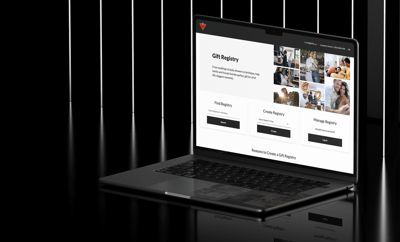
- Designed the landing page to serve three user types above the fold: find a registry, create one, or manage an existing account, with no ambiguity between the paths.
- Design system adapted layer by layer: color tokens, typography, spacing, and full component rebuilds for text fields, product cards, and buttons. Not a reskin, a rebuild.
- Simplified co-branded navigation prevented a long-term maintenance dependency between two platforms while keeping users oriented within the Canadian Tire ecosystem.
- Password validation redesigned as a real-time checklist, addressing usability and accessibility in one pattern.
- Triangle Rewards placed at end of sign-up, optional, keeping the flow clean for non-members while surfacing loyalty value at the natural completion point.
- Shared component documentation gave both engineering teams a single source of truth across two organizations.
Canadian Tire landing page
THE SOLUTION
A registry that feels like it always existed on canadiantire.ca
The final experience spans the full user journey: a landing page serving three user types simultaneously, product page entry, account creation, registry management, and settings. Every touchpoint aligned to Canadian Tire’s exact brand standards.
The landing page surfaces Find, Create, and Manage above the fold with no ambiguity. Below the fold it connects directly into Canadian Tire’s product catalog through category links and live product cards from real registries.
Triangle Rewards is integrated naturally into sign-up. Password validation guides users in real time. Every screen works in English and French without breaking.
From a systems perspective, the component library is fully documented, brand-compliant, and built to scale. Adding future features does not require rebuilding the foundation.
THE OUTCOME
The anchor partnership that opened the Canadian market
The Canadian Tire integration established MyRegistry’s credibility in Canada and became the catalyst for broader market growth.
- Canada became the #2 country in the platform by active users
- 26K monthly active users from Canada
- 11.6% year-over-year growth since the integration launched
- 8 new retail partners joined the platform following Canadian Tire
- Full bilingual support in English and French at launch
Deep Dive
MY ROLE & OWNERSHIP
End-to-end, from strategy to staging
I owned this project from the first design decision through production validation. This was not a handoff engagement. It required operating as a systems architect, bilingual UX designer, and cross-functional connector simultaneously.
What I owned
- Landing page design serving three user types: find, create, and manage
- Design system customization to Canadian Tire's exact brand standards
- Full user journey UX across all screens and states
- Bilingual design: English and French in parallel
- Triangle Rewards field placement and integration logic
- Password validation pattern and developer logic documentation
- Navigation bar redesign to avoid friction between platform
- Design QA across all screens before staging
- Direct collaboration with Canadian Tire stakeholders
How I operated
I documented implementation logic for developers, not just handed off screens.
Once the product was ready for review, I stress-tested every user flow to ensure both languages behaved correctly across the experience.
I made real-time adjustments during stakeholder review to meet Canadian Tire’s standards before staging.
KEY DESIGN DECISIONS
Five problems worth explaining
DECISION 01
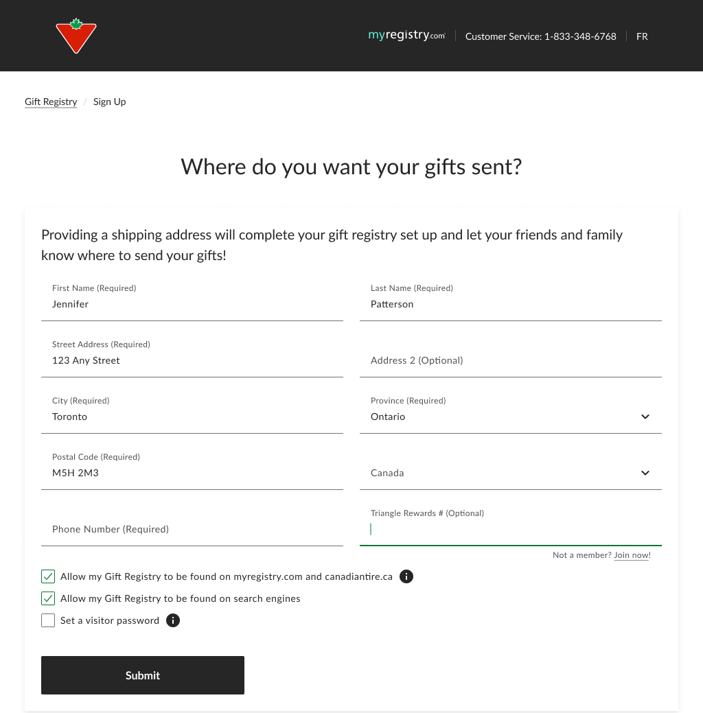
Where does Triangle Rewards belong in the flow?
Not all Canadian Tire customers are Triangle Rewards members. Placing the field early creates friction for the majority. Placing it too late buries a valuable feature.
I positioned it at the end of the sign-up form, after all required fields, marked optional. For non-members, a “Not a member? Join now” link opens enrollment in a new tab, letting users join and return without losing progress.
This required close coordination with back-end engineering. The API integration had to align precisely with where and how the field appeared.
Hover to zoom
Tap to zoom
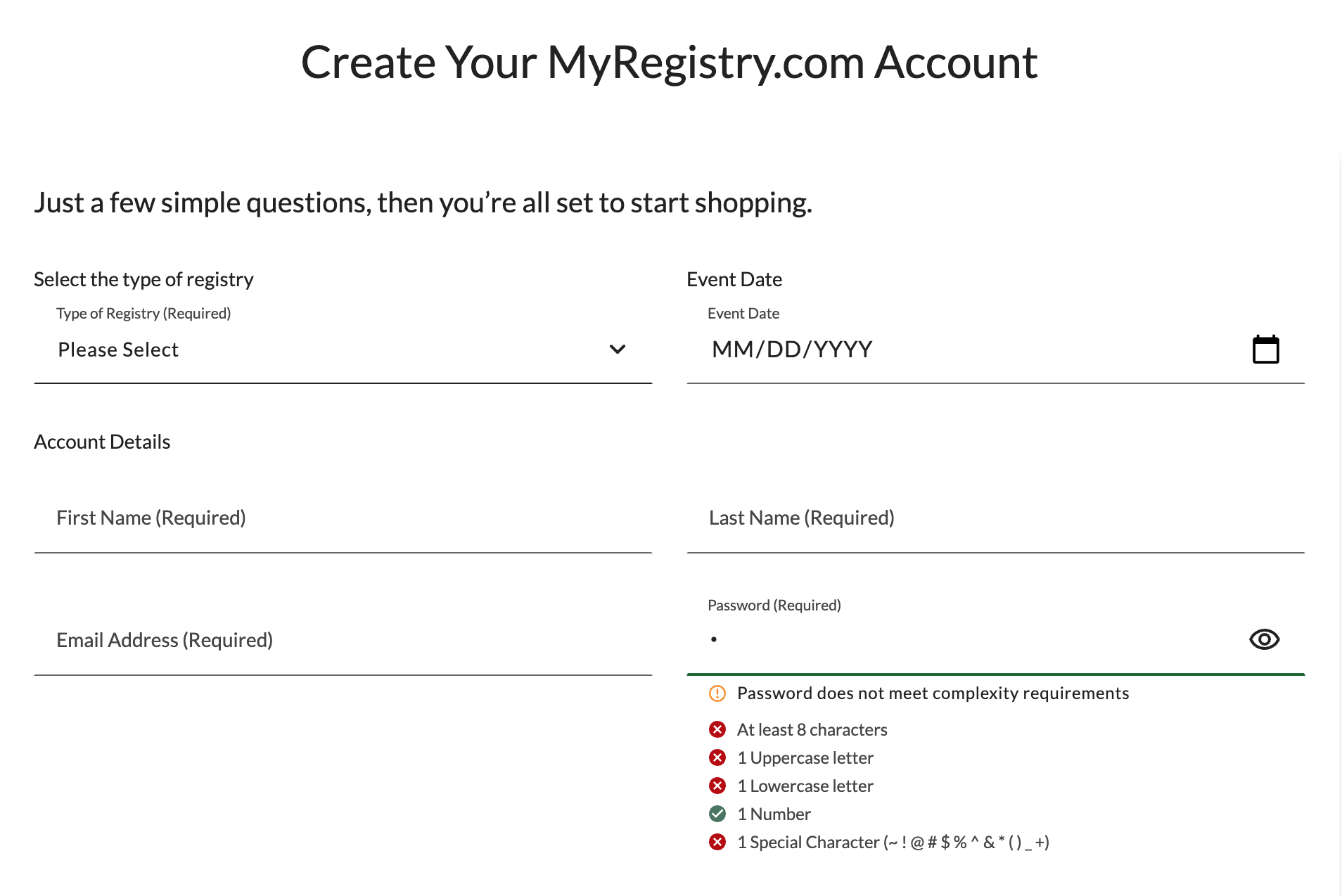
DECISION 02
Password validation: usability and accessibility in one pattern
Canadian Tire required a high-complexity password standard. The existing approach was a single helper text message shown only after a failed attempt.
I redesigned it as a real-time checklist: all rules shown upfront with live pass/fail indicators as the user types. I also documented the validation logic explicitly for developers, mapping each visual state to its condition.
Users can track their own progress incrementally. No guessing, no repeated failures.
Hover to zoom
Tap to zoom
DECISION 03
A simplified nav to prevent a maintenance dependency
The registry is hosted by MyRegistry, not Canadian Tire. Replicating Canadian Tire’s full navigation inside the registry would have created an ongoing maintenance problem: every time Canadian Tire updated their nav, the registry would need a matching change, adding unnecessary overhead across two organizations.
My proposal was a co-branded navigation featuring both the Canadian Tire logo and MyRegistry branding, simplified intentionally. This kept users oriented within a familiar Canadian Tire context while being transparent that they were in a partnership experience, which builds trust rather than hiding the integration.
The simplified nav also meant Canadian Tire could update their main site navigation without any impact on the registry. Stakeholders accepted this quickly once the maintenance risk was framed clearly.
DECISION 04
Adapting the design system layer by layer
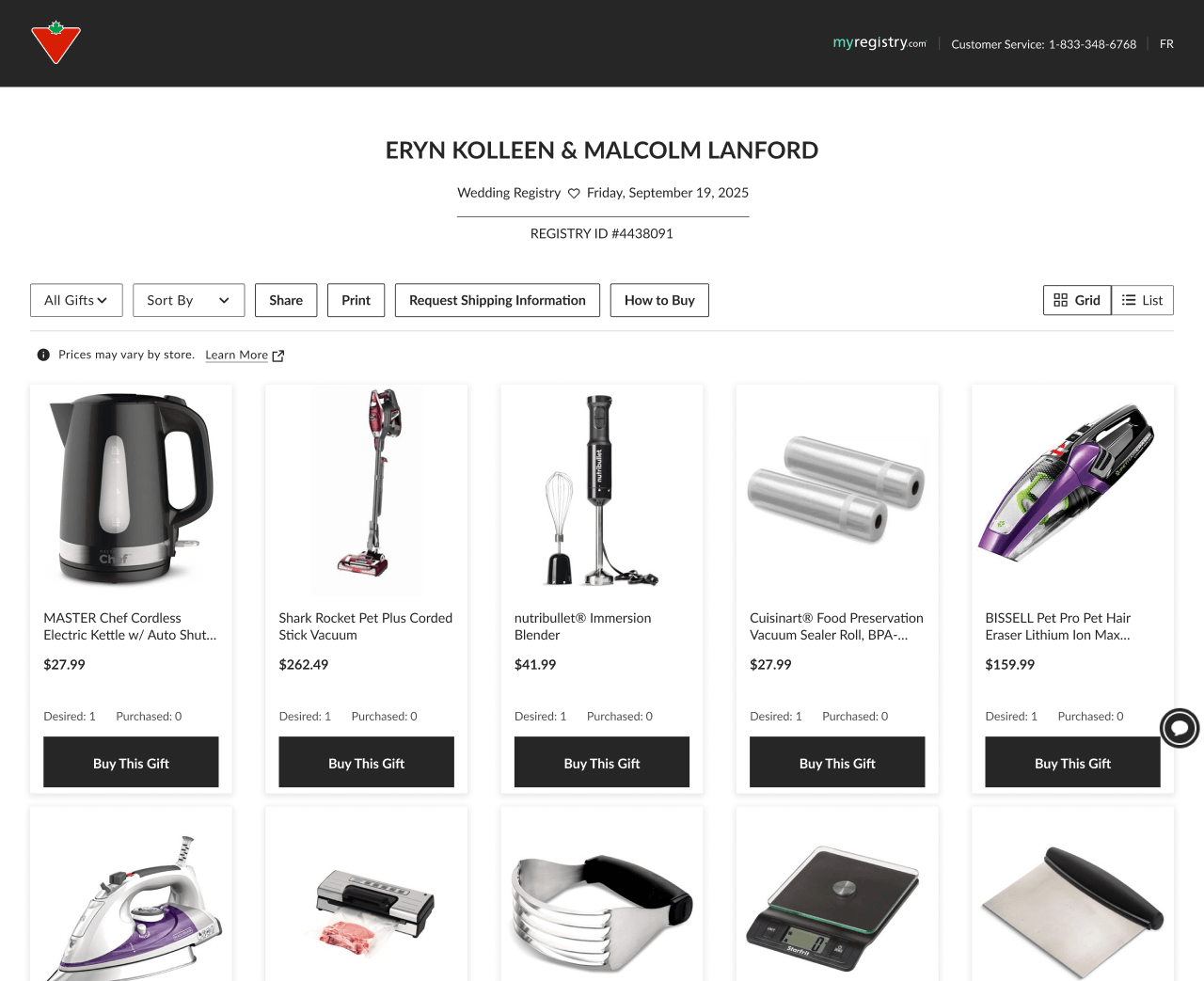
This was not a reskin. I adapted every layer of MyRegistry’s design system to match Canadian Tire’s exact standards: color tokens, typography, spacing, and individual components including product cards, modals, buttons, and form fields.
The text field was the hardest component. It differed significantly from MyRegistry’s core component and required a full redesign from scratch, not just a token update. Product cards and buttons followed the same path: the visual language was different enough that close was not good enough.
Because of those rebuilds, I had to validate that the gift list worked correctly in both list and grid view across every breakpoint. That validation happened at three stages: in the design file, during design review, and again during QA. Any inconsistency at one breakpoint or one view state would have broken the illusion of a native experience.
The standard I held every component to was simple: if a Canadian Tire customer could not tell it came from a different platform, it passed.
DECISION 05
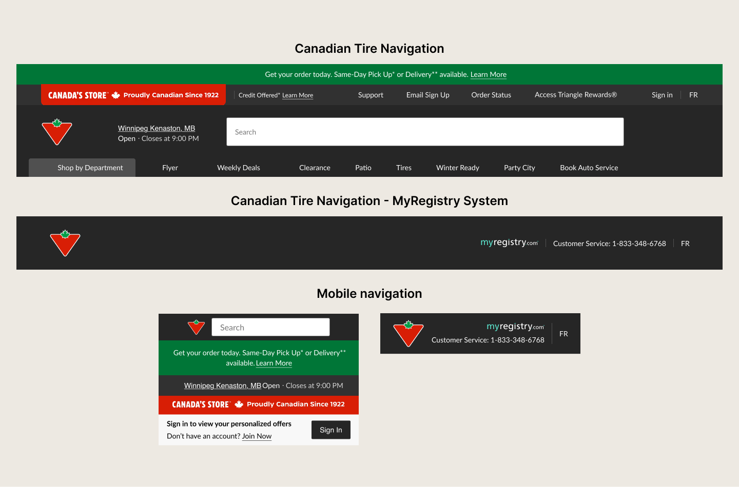
Designing the landing page: one screen, three user types
The landing page is the first thing a Canadian Tire customer sees when they arrive at the registry. It had to serve three completely different users simultaneously: someone searching for an existing registry, someone creating one for the first time, and someone returning to manage their account.
All three paths are surfaced above the fold with distinct CTAs, no hierarchy confusion, and no extra clicks to find your entry point. Getting that balance right without the page feeling cluttered required deliberate layout decisions and clear visual prioritization.
Below the fold the page continues working hard: a reasons to register section, a banner linking back to canadiantire.ca for product inspiration, top registry categories connecting directly into Canadian Tire’s product catalog, and a recently registered gifts section showing real product cards pulled from live registries. That last section is the product card redesign in production, visible to every visitor.
The registry type selector covers twelve occasion types: Wedding, Baby, Housewarming, Birthday, Holiday, Graduation, University, First Car, Pet, Anniversary, Nonprofit, and Other. That breadth was intentional. Canadian Tire’s customer base spans every life stage and the registry had to reflect that from day one.
The co-branded navigation is live on this page: Canadian Tire logo on the left, MyRegistry on the right. The simplified nav proposal I made to stakeholders is what you see in production today.
Canadian Tire landing page
DECISION 06
Designing a full email communication system
The email work was not a single template. I designed a complete email system covering every major registry category and two distinct email types: a welcome email for new registrants and a re-engagement email for users who had not yet added any items.
Across five registry categories: Wedding, Baby, Gift List, Non-Profit, and a general Complete Sign-up flow. each email has its own hero image, category-specific headline, tailored product recommendations, and contextually relevant CTAs. The Wedding emails speak to couples starting a new chapter. The Baby emails address expecting families. The Non-Profit emails are framed around charitable giving. These are not the same template with different subject lines.
The emails were delivered in English and French. Translation was handled separately, but every layout decision had to accommodate both languages structurally, the same constraint I managed across the web platform.
The co-branded header is consistent throughout the entire email suite: Canadian Tire logo on the left, MyRegistry on the right, dark background. The simplified navigation decision I made for the web platform carries through to every email a user receives.
The re-engagement emails follow a distinct, lighter pattern: minimal layout, a single urgent CTA, and short direct copy. Designing two structurally different email templates per category required maintaining brand consistency while serving two completely different user moments.
Email Designed for Canadian Tire
Reflection
What this project taught me
I came into this project with a solid design system foundation. What I did not anticipate was how much working at Canadian Tire’s level of brand rigor would raise my own bar.
MyRegistry’s base design system gave me a starting point, but the depth of customization required for Canadian Tire pushed me into territory I had not worked in before. Every component had to be interrogated, not just adapted. The text field alone required a full rebuild. That process of going layer by layer, token by token, forced a precision in my thinking that I carried into everything else on the project.
Working side by side with one of Canada’s largest retailers also sharpened my process. When the stakeholder on the other side has enterprise-grade standards and a decade of brand equity to protect, there is no room for “close enough.” That pressure cleaned up how I document, how I hand off, and how I validate. It made me a more rigorous designer.